The Book of Rose
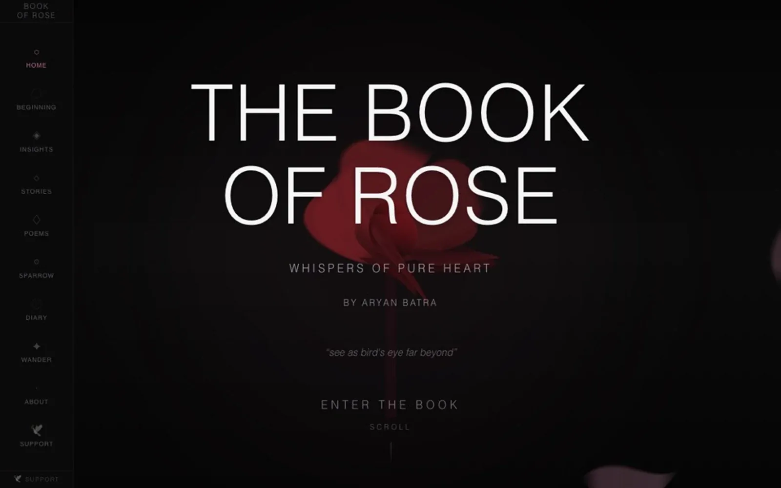
An interactive story built as a sequence of typographic rooms — a dark cover, a single rose, and a reading experience that uses the screen without becoming a game.
Stack TypeScript · Next.js · CSS · Scroll-driven animation
A book is a sequence of controlled reveals. The page turn, the chapter break, the white space before a line lands. The Book of Rose is an attempt to build that rhythm in a browser without turning it into a video, a game, or a scroll-jacked slideshow.
The story is short. The interface is one dark room at a time, with a rose, a line of text, and enough quiet for the line to mean something. The reader moves at their own pace. There is no autoplay, no sound that cannot be turned off, and no cursor effect that follows you around.
The design problem
The browser gives you an infinite canvas and almost no physical cues. A page in a real book has an edge, a thickness, a place in a sequence. The web has a scrollbar and a back button. The project tries to recover some of that object-ness with a fixed stage, a slow camera, and chapter markers that behave like page numbers.
Typography does most of the work. The title is set in a high-contrast serif; the body is small and quiet; the rose is the only saturated thing on the page. The colour palette is intentionally narrow — black, bone, deep red — so the flower is never competing with a UI.
The build
Next.js and TypeScript with a CSS-driven stage. The scenes are components rather than video frames, which keeps the text selectable and the whole thing accessible to a screen reader. Scroll position maps to a small set of states; the transitions are opacity and transform only. On a reduced-motion setting, the story becomes a plain sequence of chapters with no camera movement.
NOTE
The first version had a parallax rose that followed the pointer. It was beautiful for about eight seconds and then it became the only thing anyone looked at. I removed it.
What I would keep
The chapter break. A full viewport with one line of text, no navigation, and a slow fade. It is the closest the project gets to a page turn, and it costs almost nothing to build.
More from the build
Click any image. Arrow keys walk the set.