Rose Sky
Rose is an AT Protocol client built around readable records, portable identity, and a feed that does not need a recommendation engine to be useful.
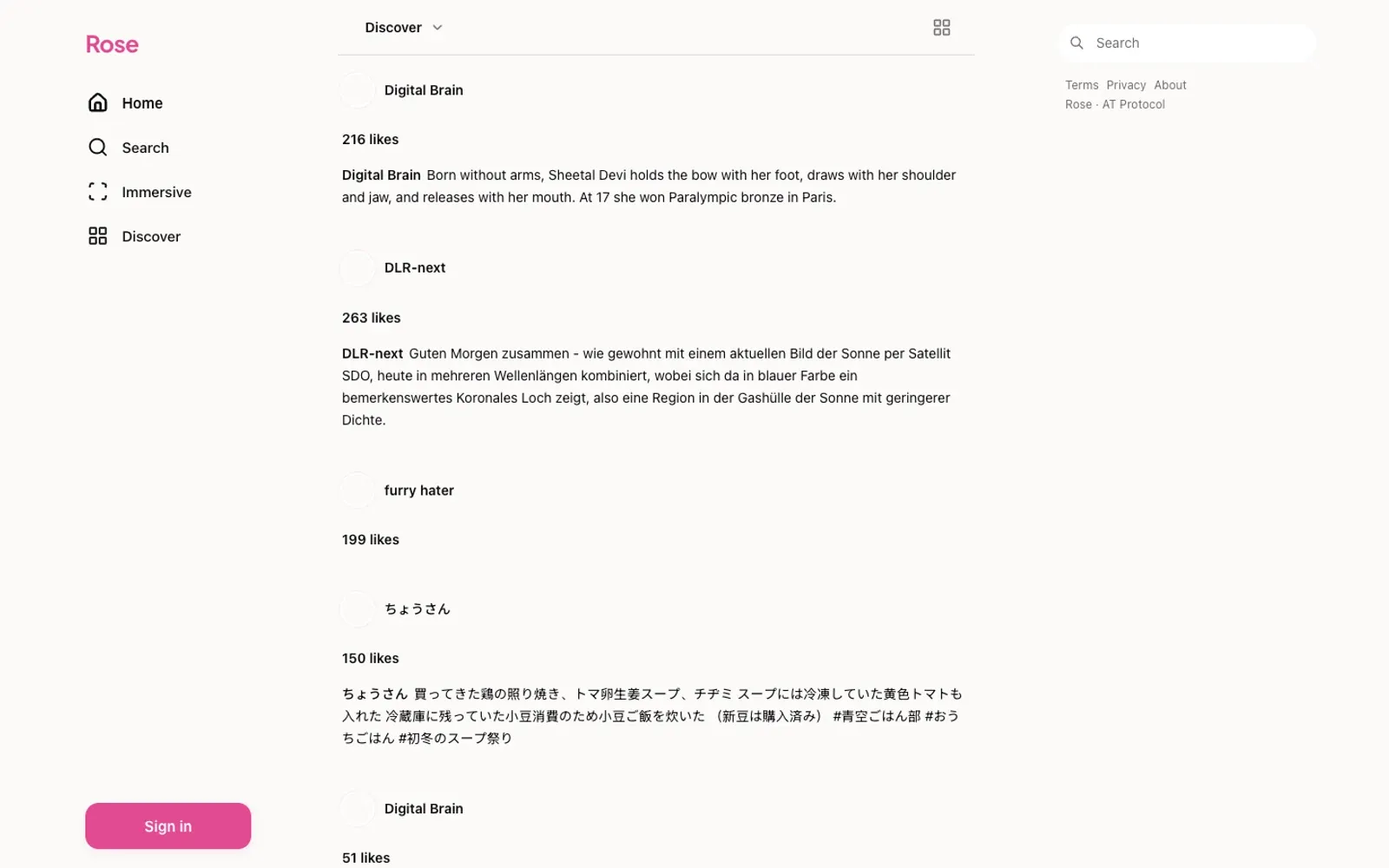
Stack TypeScript · AT Protocol · React · Tailwind CSS
AT Protocol is one of the more interesting things to happen to social software in years: identity you can carry, data you can move, and a network that does not have to be one product. Rose is a Bluesky client built to make those ideas visible instead of theoretical.
The interface is deliberately ordinary. A feed, a composer, a profile, a thread. The difference is underneath: every action maps to a record, every record has a home, and the client can show you where that home is.
What the client believes
The network is not the app. A handle is an identity, not a row in someone’s database. A post is a record with an address. The interface should make that legible without turning every screen into a protocol lecture.
A feed is a choice. Following should be enough. The default timeline is chronological, and the client does not hide the controls that change it. There is no engagement optimisation layer between the reader and the people they chose.
Small surfaces are a feature. The composer is a text box, not a production studio. The thread view keeps the reply context visible without collapsing the conversation into a tree that only its author can love.
The build
Rose is a TypeScript and React application on top of the AT Protocol. Authentication, session handling, and record writes are separated from the view layer so the client can support more than one feed shape without duplicating the plumbing. The design system is small: a type scale, a spacing scale, a handful of states, and a strict rule against decorative chrome.
The hardest part was not the protocol. It was the latency between an optimistic write and the record appearing in the feed. The client treats a pending post as a real object in the list, with a quiet state, instead of blocking the composer on a round trip.
NOTE
The best protocol feature is the one nobody has to think about. A portable handle is infrastructure until the day you need to move, and then it is the whole product.
What I would keep
The left rail. It is a map of the app in one column: home, search, notifications, lists, profile. No badge counts fighting for attention. No secondary navigation hiding the primary one. A social client should be calm enough to read.
More from the build
Click any image. Arrow keys walk the set.